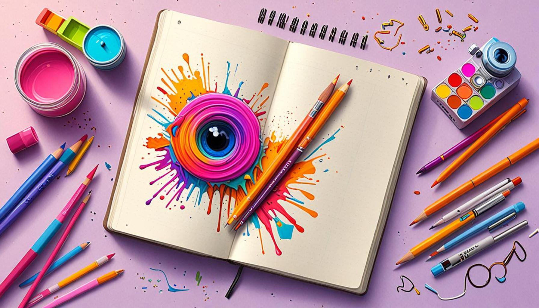
How to Use Colors to Convey Emotions in Artistic Works
The Significance of Colors in Art
Artisan expression thrives on vibrant hues, with colors serving as fundamental elements that articulate visual narratives. Different shades and tints not only adorn a canvas but also play a crucial role in embodying emotions, setting atmospheres, and lending depth to stories conveyed through visuals. A keen understanding of color theory can significantly enrich an artist’s ability to communicate complex ideas, making colors a powerful language in the realm of art.
Colors are intricately tied to emotions and cultural associations. Take the color red, for example; it is often linked to profound human experiences such as passion, love, and, at times, even anger. Think of how red roses symbolize romantic affection, while stop signs emphasize caution and alertness. Conversely, blue evokes feelings of calm and serenity, often associated with clear skies and tranquil oceans, but it can also suggest feelings of melancholy and sadness when depicted in darker tones.
Similarly, yellow represents joy and energy, reminiscent of sunshine and warmth, and is frequently used to symbolize optimism and cheerfulness. In contrast, green embodies the essence of nature and growth, establishing connections to tranquility and rejuvenation. Lastly, purple brings forth a sense of luxury, spirituality, and mystery, often associated with the divine and the unknown.
Artists who grasp the emotional capabilities of colors can create works that resonate profoundly with viewers. For instance, renowned artist Vincent van Gogh’s masterpiece, Starry Night, features dynamic swirls of blue juxtaposed with luminous yellows, beautifully capturing the tumultuous yet calming essence of the night sky. The interplay between light and shadow in this painting not only sets an emotional tone but also engages the observer in a profound dialogue about chaos and serenity.
Diving into color manipulation allows artists to effectively utilize light, shadow, and contrast to amplify emotional impact. Techniques such as chiaroscuro (the use of strong contrasts between light and dark) can help illustrate three-dimensionality and depth, further immersing the viewer in the artwork. Consider how artists like Caravaggio expertly wielded this technique to convey dramatic tension in their pieces.
This exploration of colors transcends mere aesthetics; it delves into the art of storytelling through visual means. By thoughtfully selecting and combining colors, artists can guide viewers through a spectrum of emotions and experiences that resonate long after the artwork is seen. This transformative power of color encourages both artists and their audiences to reflect and engage on deeper levels, fostering a shared experience that transcends the visual realm.
CHECK OUT: Click here to explore more
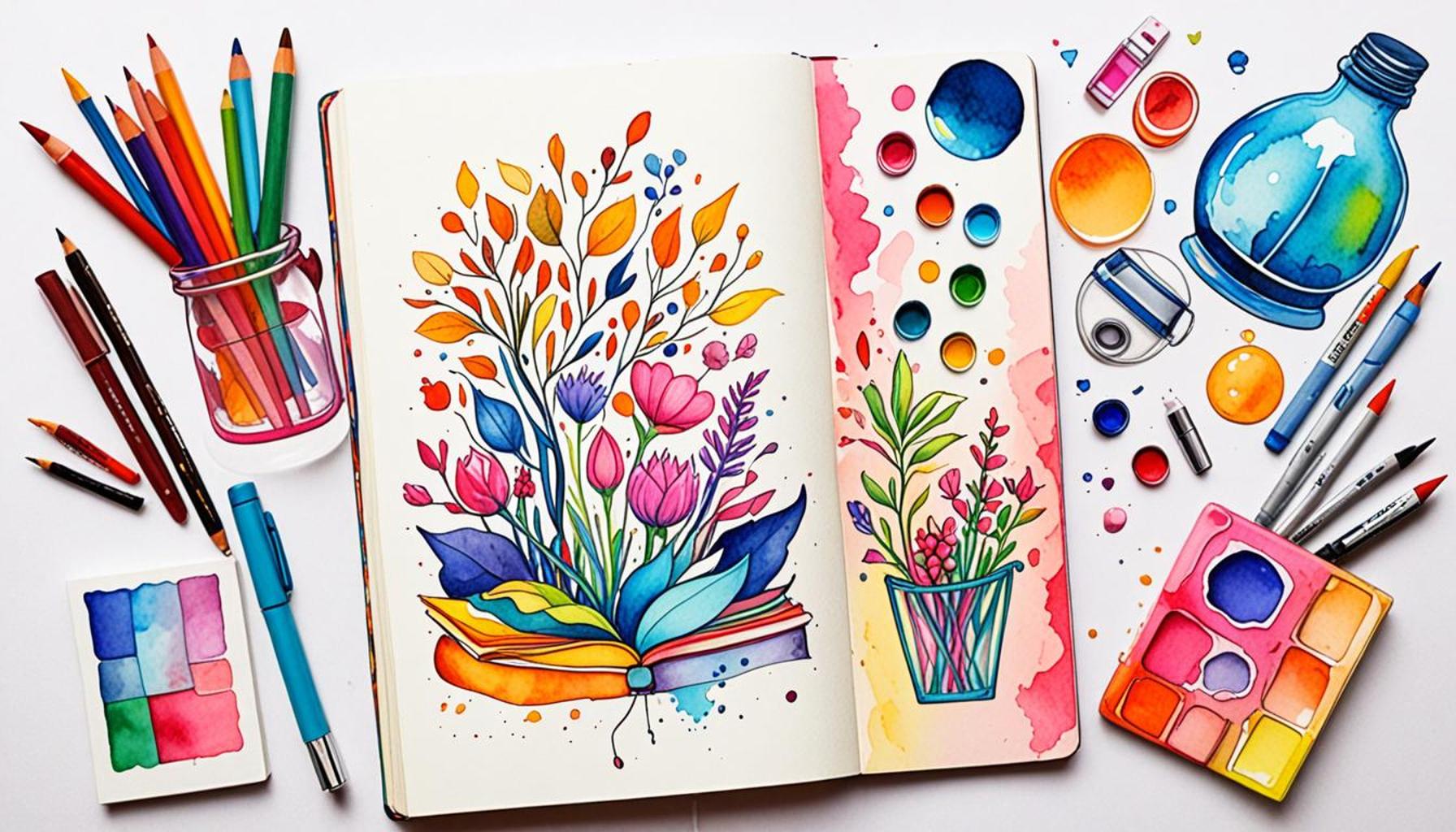
Understanding the Emotion Spectrum of Colors
To harness the full potential of colors in artistic creations, it is essential to recognize the emotional spectrum they can evoke. Artists have the ability to paint not just with shades, but with the feelings tied to those hues. A well-rounded palette, informed by the emotional impacts of color, can guide the viewer’s thoughts and foster a connection with the piece.
One classic method for categorizing emotions associated with colors is to examine their psychological effects. Here’s a brief overview of some commonly used colors and their typical emotional associations:
- Red: Stimulating and attention-grabbing, red is often associated with feelings of love and passion, but it can also intensify sensations of anger or urgency.
- Blue: From tranquility to sadness, blue is versatile; it can create a calming atmosphere or convey depths of sorrow, depending on the tone and context.
- Green: Infusing scenes with vitality, green represents growth and nature, encouraging feelings of harmony and renewal.
- Yellow: Radiating joy and optimism, yellow can uplift the spirit, while harsh yellows may induce feelings of caution or agitation.
- Purple: Often linked to creativity and spirituality, purple evokes a sense of mystery and introspection, perfect for artworks that provoke thought.
When artists mix these colors, they can create a rich tapestry of emotions. The alignment of different hues can evoke specific reactions based on familiarity, culture, and personal experiences. For instance, in the United States, national colors like red, white, and blue can evoke emotions tied to patriotism and unity, while local artists may incorporate regional color schemes to convey unique cultural narratives.
Consider renowned artists like Georgia O’Keeffe, whose floral paintings use vibrant colors to evoke both sensuality and serenity. By carefully monitoring the colors within her works, O’Keeffe illustrates how hues can transform ordinary subjects into powerful emotional statements, inviting viewers to feel as they gaze upon her captivating creations.
Moreover, artists like Wassily Kandinsky famously took color theory a step further by associating specific colors with shapes and musical notes, proposing that sound, sight, and emotion could intertwine in profound ways. Such innovative approaches encourage artists to think beyond traditional boundaries and to delve into how colors can facilitate emotional connections on multiple levels.
The emotional language of colors is not merely academic; it transforms the way we engage with and interpret art. By utilizing colors wisely, artists can craft profound narratives that linger in the mind, urging viewers to not only admire the aesthetic but also to absorb the emotional currents woven into the artwork. This mastery of color can help both seasoned artists and novices alike to enhance their storytelling capabilities, ultimately making each piece more relatable and impactful.
| Emotional Impact | Color Associations |
|---|---|
| Joy and Happiness | Bright colors like yellow and orange evoke feelings of cheerfulness and positivity. |
| Calm and Serenity | Cool tones, such as blue and green, represent tranquility, often associated with nature. |
| Passion and Energy | Red and vibrant hues can convey intense emotions like love or anger. |
| Melancholy | Darker shades, including deep blues or grays, often signify feelings of sadness and introspection. |
In the world of artistic expression, understanding the role of color is crucial for evoking the desired emotional resonance in audiences. Each hue carries with it a plethora of meanings and associations that artists can leverage. For instance, warm colors typically stimulate feelings of excitement and warmth, while cool colors often provide a sense of calm. Furthermore, cultural context can shift the interpretation of specific colors. For example, in Western cultures, white is traditionally a symbol of purity, while in some Eastern cultures, it could represent mourning. The effective use of colors not only enhances the visual appeal of artistic works but also deepens the emotional connection viewers experience. By strategically choosing colors aligned with themes and emotions, artists can guide their audiences through a vibrant emotional landscape, encouraging deeper engagement with their work. Exploring how different colors influence perception can further enhance an artist’s ability to communicate effectively, creating a powerful narrative within their work. As you ponder the next piece you create or view, consider the emotional language of colors and the stories they tell.
SEE ALSO: Click here to read another article
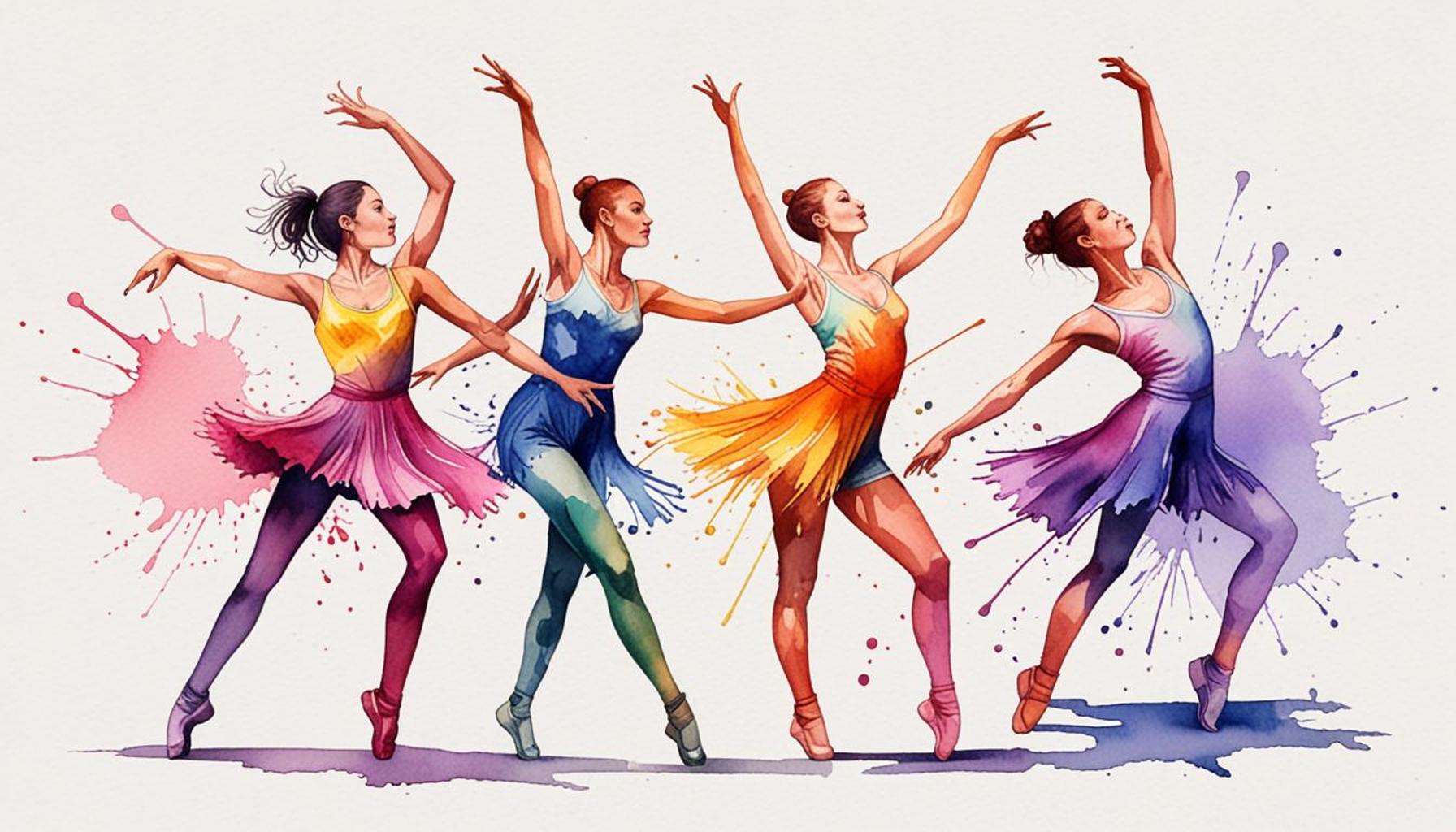
The Role of Color Composition in Emotional Expression
As crucial as understanding individual colors may be, the composition of those colors within a piece is equally significant. Artists don’t merely select colors randomly; they consider how different hues interact with each other to create emotional harmony or tension. The positioning of colors can alter the perception of the artwork, much like inflections can change the meaning of spoken language.
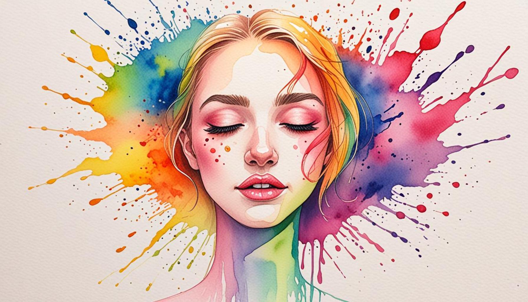
One effective technique is the use of color contrast. High contrast combinations, such as orange against blue or red against green, can create energy and excitement. This method attracts attention and evokes strong emotions. However, too much contrast can overwhelm the viewer, which leads artists to find a balance that still delivers impact without discordance. For instance, the works of Marc Chagall often exploit contrast to express love and despair simultaneously, as seen in his famous paintings where vibrant cool and warm tones evoke a kaleidoscope of emotions.
Moreover, understanding the temperature of colors—whether they are warm (reds, oranges, yellows) or cool (blues, greens, purples)—can also enhance an artwork’s emotional message. Warm colors tend to express feelings of warmth, vivacity, and exuberance; they invoke sensations of comfort or excitement. In contrast, cool colors can elicit calmness, contemplation, or sadness. A seasoned artist can blend these temperatures effectively to communicate nuanced emotional states. For example, Edward Hopper’s captivating depictions of city life use cool blues and greens to evoke solitude and disconnection, even amidst bustling environments, allowing audiences to feel the isolation of urban existence.
Layering colors also plays an important role in conveying emotion through depth and texture. The technique of glazing, where transparent layers of color are applied over one another, can build richness and complexity in the emotional undertones of a piece. This gradual reveal allows for a dynamic viewing experience as more layers become visible, leading to deeper emotional engagement. Artists like Paul Cezanne employed such techniques to render landscapes and still lifes that pulse with life, where each color layer adds to its emotional resonance.
Additionally, the usage of monochromatic palettes presents another fascinating method for emotional expression. By utilizing varying shades and tints of a single color, artists can convey a sense of harmony or focus, emphasizing specific feelings without distraction. The works of works of artists like Yves Klein, who is known for his iconic blue creations, utilize monochrome effectively to induce a meditative state in the viewer. The intensity of the single color leads to an immersive experience, inviting introspection and emotional resonance.
As a concept that transcends basic usage, the emotional implications embedded within color composition remind us that artistry is striving for connection. Understanding how to manipulate color in relation to emotion not only enhances artistic expression but also invites viewers to experience art on a deeper level, allowing for profound connections that lead to personal reflections and communal dialogues.
CHECK OUT: Click here to explore more
Conclusion: Embracing Color as an Emotional Language
In summary, the intersection of color and emotion in artistic works opens a fascinating dialogue between the artist and the viewer. By skillfully selecting and arranging colors, artists can evoke a wide spectrum of feelings, from joy and excitement to melancholy and contemplation. The ability to manipulate color composition, including strategies such as color contrast, temperature, layering, and monochromatic palettes, empowers artists to create profound emotional experiences.
Consider how renowned artists like Vincent van Gogh or Georgia O’Keeffe used their unique approaches to color to express their inner worlds. Van Gogh’s dynamic use of vibrant yellows and intense blues invites viewers into an emotional whirlwind, while O’Keeffe’s softer palettes offer a tranquil reflection of nature’s beauty. These examples illustrate that through artistic choices, colors transcend mere visual elements to become a vital language of sentiment.
Engaging with artworks can lead us to deeper connections with our own emotions and those of others. As you navigate through the myriad hues and tones in artistic expressions, be open to discovering how colors resonate within you. Whether you’re an aspiring artist or an enthusiastic observer, embracing the emotional power of color not only enriches your understanding of art but also inspires personal insights and communal conversations. So next time you encounter a piece of art, pause and reflect—what emotions do the colors evoke in you? The inquiry could lead to delightful revelations and a greater appreciation for the intricate relationship between color and emotion in art.